
The development of blue transferware
Transfer printing transformed the British ceramics industry during the second half of the eighteenth century. Before its development, elaborate decoration generally required skilled painters working directly on individual objects. Transfer printing offered a means of reproducing intricate designs on a commercial scale while retaining much of the visual sophistication of engraved prints.
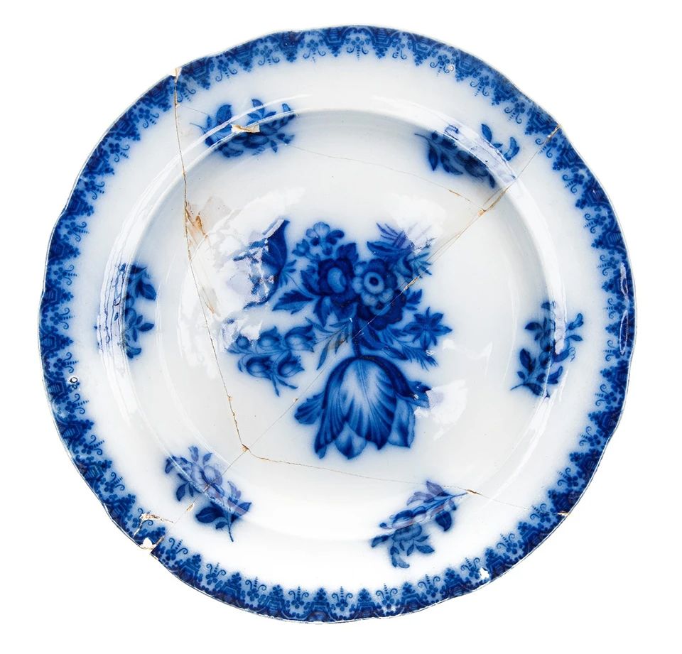
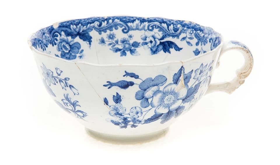
The technique emerged in England around the middle of the eighteenth century, with early development associated with Worcester, Liverpool, and other manufacturing centers. By the closing decades of the century, Staffordshire potters, including Josiah Spode and Josiah Wedgwood, had helped establish transfer printing as an important industrial decorating process. During the nineteenth century, it became one of the defining characteristics of English tableware.
The traditional process began with an engraved copper plate, its recessed lines carrying a ceramic pigment, commonly based on cobalt for blue decoration. The printer transferred the inked design to specially prepared paper, which was then applied to a ceramic surface. After the paper was removed, the image remained on the ware, typically beneath a transparent glaze. Subsequent firing fused the decoration and glaze into a durable surface.
The sophistication of this procedure was considerable. A single engraved design might incorporate architecture, landscape, figures, foliage, and complex ornamental borders, all reproduced repeatedly on plates, bowls, pitchers, tureens, and other wares.
The familiar Blue Willow pattern illustrates the commercial success of this process, but Staffordshire factories produced thousands of designs. American historical scenes, European landscapes, romantic architecture, floral compositions, and imagined Chinese views all found their way onto British dinner tables and into the expanding American market.
The arrival of flow blue
Flow blue developed from conventional blue transfer printing during the late 1820s and 1830s, although its precise beginnings remain somewhat uncertain. The earliest flowing effects may have resulted from the unintended migration of cobalt pigments in firing. What may initially have been regarded as a manufacturing fault became a recognizable and commercially successful decorative treatment.
The difference was not a new method of applying the original image. Most flow blue wares were decorated by familiar transfer-printing procedures. The innovation lay in what happened afterward.
By altering conditions during the glaze firing, potters could encourage the blue pigment to spread beyond the boundaries of the engraved design. The resulting appearance ranged from slight feathering along the outlines to deep, saturated expanses of blue in which the original details became partially obscured.
The characteristic effect was obtained by introducing volatile substances into the firing environment, commonly described in historical accounts as chloride-bearing compounds. Their vapors influenced the behavior of the cobalt decoration during firing, allowing it to migrate into the surrounding glaze. It was not simply a matter of applying additional blue ink or printing a blurred design.
The name flow blue, also encountered historically as flown blue or flowing blue, describes this diffusion of color.
From Staffordshire to America
Flow blue was principally a product of the British pottery industry, with Staffordshire manufacturers such as Davenport, Spode, Minton, Wedgwood, and numerous others participating in its development and production.
Although the wares were manufactured in Britain, their popularity became particularly pronounced in North America. By the 1840s, flow blue had become an important export commodity, finding buyers among American households that wanted fashionable and durable tableware.
Its aesthetic offered something different from the precise illustrations of conventional transferware. The softened edges and rich cobalt tones suggested a more atmospheric, painterly treatment, sometimes resembling watercolor washes. This effect was especially suitable for romantic landscapes, architectural scenes, and floral compositions.
The historical evidence also points to an interesting commercial distinction: flow blue seems to have enjoyed greater popularity in the United States than in its country of manufacture. Archaeological research citing ceramic historian Robert Ewins identifies substantial American demand during the middle decades of the nineteenth century, accompanied by less comparable attention in British advertising.
Flow blue was by no means confined to one brief period. Early scenic and Chinese-inspired designs were followed by more elaborate floral and ornamental patterns, and production continued through the later nineteenth century into the early twentieth century. American manufacturers eventually entered the market themselves.
The style therefore belongs not simply to the 1840s or 1850s, but to a much longer evolution of commercial ceramic decoration.
The evolution of flow blue patterns
Although the manufacture of flow blue continued for many decades, its decorative development can be divided into several broad periods. These should be treated as stylistic guides rather than absolute dating rules.
Early flow blue, approximately 1830–1860, frequently employed Chinese-inspired landscapes, pagodas, bridges, pavilions, and exotic gardens. Such designs continued the popularity of chinoiserie established by earlier English transferware. The degree of diffusion varied considerably, with some examples preserving much of the original engraving and others displaying extensive spreading of the pigment.
Middle-period flow blue, approximately 1860–1880, increasingly embraced floral compositions, romantic ornament, and elaborate border treatments. Large flower heads, scrolling foliage, and decorative reserves could be especially effective when rendered in deep cobalt blue. Gilded details were sometimes added to create a more luxurious appearance.
Late flow blue, approximately 1880–1920, often featured more open compositions, prominent central flowers, and decoration concentrated around the rims of plates and serving dishes. Japanese-inspired designs and fashionable ornamental treatments appeared alongside traditional floral patterns. Production continued beyond 1900, and a late nineteenth-century appearance should not automatically be mistaken for early manufacture.
Archaeological classifications support this broad chronological development. Research compiled by the Maryland Archaeological Conservation Laboratory places many Chinese-inspired flow blue patterns in the earlier nineteenth century, while central floral compositions are strongly represented in the decades around 1890–1905.
Was all flow blue actually blue?
Despite its name, the flowing technique was not confined to cobalt blue. Potters experimented with other ceramic pigments capable of producing comparable diffusion during firing. The broader category is sometimes described as flown colors or flow wares.
Blue remained overwhelmingly associated with the technique, but several additional color families are documented.
Cobalt blue
The classic color, ranging from medium blue to an almost inky navy. Its rich saturation and characteristic halos define traditional flow blue.
Mulberry or purple
One of the best-documented alternatives. Shades range from reddish purple and plum to dark violet. Mulberry flow wares were particularly associated with the middle nineteenth century.
Brown or sepia
Brownish flowing decoration produced warmer, softer effects reminiscent of sepia-toned engravings. Such pieces are less commonly encountered than cobalt blue examples.
Black
Black flown decoration could produce smoky gray halos, creating a subdued alternative to brilliant blue.
Green
Green flowing decoration is documented but uncommon. It should be distinguished from ordinary green transfer printing, which was considerably more widespread.
Colors are illustrative swatches, not reproductions of historical ceramic pigments.
The Maryland Archaeological Conservation Laboratory specifically identifies purple, brown, black, and green among historical flown colors. Its dating tables also document mulberry flowing wares beginning in the late 1820s.
It is important to distinguish these wares from conventional colored transferware. Purple, green, brown, pink, and black transfer printing were commonplace during the nineteenth century. A purple transfer-printed plate is not necessarily a piece of mulberry flow ware. The defining feature remains the migration of pigment beyond the original printed design.
How to distinguish blue transferware from flow blue
The most reliable identification method is close examination of the decoration, preferably under magnification.
Characteristic | Blue transferware | Flow blue |
|---|---|---|
Printed outlines | Generally crisp and defined | Softened, feathered, or blurred |
Fine details | Engraved lines often clearly visible | Lines may merge or disappear |
Blue pigment | Mostly confined to the design | Spreads into surrounding white areas |
White background | Usually comparatively clear | May show blue halos or diffuse staining |
Overall effect | Graphic, engraved | Soft, atmospheric, sometimes almost painterly |
Manufacture | Predominantly late 18th century onward | Predominantly c. 1830–early 20th century |
A critical distinction concerns color intensity. Dark blue transferware is not necessarily flow blue. Some of the earliest nineteenth-century transfer patterns employed an exceptionally deep cobalt blue, often called dark blue or historical blue. These prints may appear almost black in heavily decorated areas, but their edges remain comparatively well defined.
Conversely, genuine flow blue does not have to display extreme blurring. Some pieces show only modest halos, particularly around flowers, architectural features, and border ornaments. A light degree of diffusion can be entirely consistent with the technique.
The most convincing evidence comes from examining transitions between blue and white. If the color appears to dissolve gradually into the glaze beyond the pattern boundary, the piece may be flow blue. Where the engraved lines remain crisp and distinctly separated, conventional transfer printing is the more likely identification.
Care must also be taken not to confuse intentional flowing effects with ordinary printing defects. Smudges, poorly transferred designs, printing misalignments, and glaze disturbances can all produce irregularities. Flow blue generally exhibits a more consistent migration of color across the decoration.
Collecting and dating flow blue
For collectors, the distinction between the two decorating techniques is only the beginning of identification. Maker, pattern, body, shape, and backstamp must also be considered.
English flow blue was produced on several ceramic bodies, including refined earthenware and white-bodied wares commonly sold as ironstone. The word ironstone is not interchangeable with flow blue: one describes a type of ceramic body, while the other describes the decorative treatment.
Backstamps can be particularly useful. Registered design marks, manufacturer names, pattern titles, and country-of-origin statements may help establish a production period. Nevertheless, marks should be interpreted cautiously, since factories sometimes retained names or designs for considerable periods.
Other characteristics worth examining include the form of the vessel, the shape of its rim, the presence of gilding, and the nature of the glaze. The transition from early scenic designs to later floral patterns provides another useful, though not conclusive, dating clue.
Condition deserves equal attention. Crazing, staining, rim chips, cracks, and old repairs occur frequently in nineteenth-century tablewares. Dark cobalt decoration can sometimes conceal damage, making careful inspection essential.
Neither conventional blue transferware nor flow blue should be assumed to be valuable simply because it is old. Rarity of pattern, attribution, historical interest, condition, and collector demand are generally more important than the decorative technique alone. Certain desirable historical blue patterns can be considerably more valuable than commonplace flow blue, while exceptional flow blue forms and patterns can command substantial premiums.
A final observation: An industrial process becomes an aesthetic
The history of flow blue is an instructive example of how manufacturing characteristics can become deliberate artistic effects.
Transfer printing began as an industrial innovation intended to reproduce elaborate decoration efficiently and consistently. Its appeal rested partly on the ability to produce recognizable engravings in large quantities. Flow blue introduced an apparently contradictory preference: a technique that deliberately surrendered some of that precision.
Whether its earliest appearance was accidental or experimental remains uncertain, but manufacturers came to recognize the commercial possibilities of the softened image. What might initially have been classified as an imperfect transfer became a distinctive decorative style.
The resulting wares reflect both the technical accomplishments of nineteenth-century ceramic factories and the changing tastes of their customers, especially in America. Blue transferware and flow blue thus represent two expressions of the same technology: one celebrating the precision of reproduction, the other exploiting the decorative possibilities of diffusion.
For the collector, the lesson is simple but important. The presence of cobalt blue does not determine the classification of a piece. It is the behavior of that blue—its relationship to the engraved outlines and the surrounding glaze—that distinguishes conventional transferware from flow blue.
References and further reading
1. National Park Service. Transfer Print Ceramics at Fort Vancouver. A useful account of transfer printing, nineteenth-century Staffordshire production, colors, and identifiable Spode patterns. Read the NPS article.
2. Maryland Archaeological Conservation Laboratory. Patricia Samford, Colonial and Post-Colonial Ceramics (2014), particularly the section on underglaze printed earthenwares and flown colors, pp. 22–28. Includes dating ranges and comparative archaeological evidence. View the research presentation.
3. The Metropolitan Museum of Art. Collection records for Staffordshire transferware produced for the American market, including works by James and Ralph Clews and Mellor, Venables & Co. View a documented flow-blue example.
4. Albert County Museum. Janet Clouston, Artefact of the Week: Flow Blue Transferware (2021). Discusses the uncertain accidental origins and subsequent collecting popularity of the technique. Read the museum article.
5. Ewins, Robert. Research on flow blue manufacture and its American export market, discussed in archaeological reports including Archaeological Investigations at 41BX1968, Center for Archaeological Research, University of Texas at San Antonio. Further examination of Ewins's underlying research would be useful for reconstructing individual makers' export histories.